Slack recently introduced a sweeping overhaul of its platform. The all-new redesign of Slack offers a cleaner navigation experience of the app's user interface. This has long been a criticism of Slack. That is to say, the app's lack of user-friendliness. In an attempt to rectify this, so everyone, developers, those with limited-technical experience, and those with no experience, can use Slack with ease.
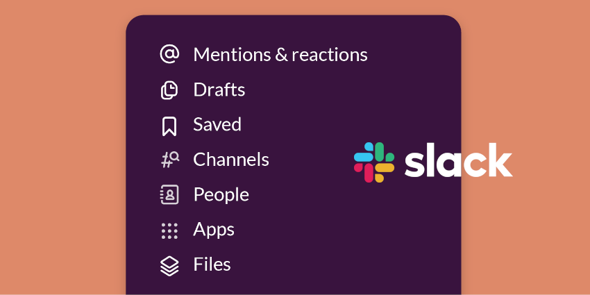
COVID-19's timing aside, Slack's updated platform appeals to new users as well as Slack loyalists and makes it easier to customize the sidebar. The company also added a new 'compose' button, a navigation bar at the top and made several other changes that streamline the onboarding process and reduce the learning curve associated with the app.

Slack's new sidebar is one of the most anticipated changes to the platform, which completely overhauled the way messages, channels, and apps function within the app. Users can now group them into hidable segments within the sidebar, similar to the way you'd group messages in a folder in an email thread. Think about the emails you get with a lot of moving parts such as group and personal direct messages regarding a special project. This feature is exclusive to Slack's paying customers only though.

There are a ton of freebies, however. So, let's explore what else Slack did to update its platform, a sweeping gesture, expressly as millions of employees across the globe shift to remote work and rely on free as well as paid tools for a productive and reliable remote working experience.
Slack new compose button is more noticeable than its predecessor and is accessible from anywhere in the platform. According to Slack, users can draft a message as a direct message or as a Slack channel, "message history for the draft is previewable before sending" Slack wrote in a blog post regarding the update.