
Usually, audits aren’t triggered by disasters; they just start with a simple request. Someone wants a list of who’s using certain collaboration apps, hardware, or tools. Or your finance team just needs a clearer look at telecom costs by department. These asks aren’t unreasonable, but they can be difficult to respond to if you don’t already have a clear UC services map.
Maybe the data exists, but it’s scattered across five different systems, or you simply don’t know exactly which insights to track. Unified communications and collaboration ecosystems have expanded significantly over the years, to the point where a lot of organizations have serious visibility gaps.
One team owns the phone systems, another handles Zoom licenses, and someone else manages mobile lines and plans. It all works until someone needs a full picture, and then things get messy.
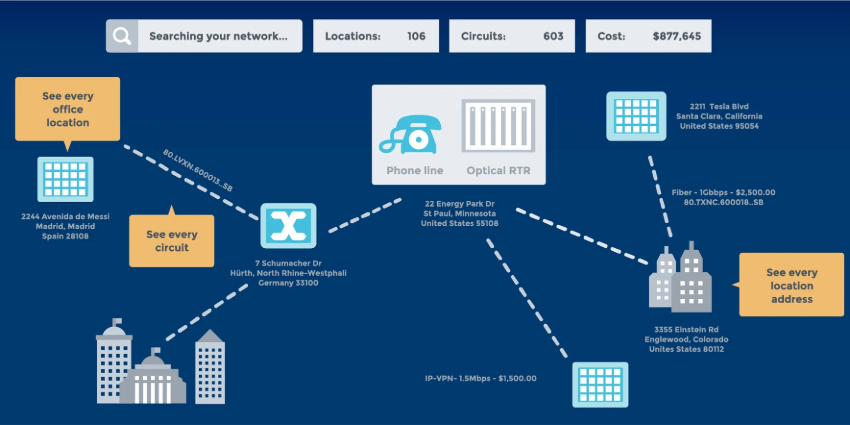
The idea of a UC services map isn’t about diagrams or fancy software. It just means knowing what you’re using, what it’s costing you, and who’s responsible for it. Most companies think they have that figured out until they try to prove it.
Calero is one company trying to help with that stage, offering a unified communication service management solution that brings telecom, SaaS, and mobile data into one place.
The UC Services Map, and What Auditors Really Want
Auditors aren’t really looking to trap companies; they’re just looking for clarity and consistency. If you’re spending money on a service, they want to see where that service lives, who’s using it, and whether it aligns with the terms you agreed to. When you can show that, you’re fine. If you can’t, you spend time digging through records to explain what happened.
With unified communications, it gets harder. There’s no single owner. IT manages the platforms, finance gets the bills, HR knows who’s still on payroll, and procurement handles the contracts. Nobody’s looking at all of it at once. That’s what slows everything down during an audit.
A few things always come up. One is duplication, multiple licenses for the same tool, or users with overlapping access. Another is services that haven’t been used in months but still appear on invoices. Then there’s the compliance issue, especially around mobile devices or SaaS apps without formal approval.
This is why connected systems matter—not to automate everything but to ensure that someone can actually answer the questions when they come up.
Building a Full UC Services Map
A lot of audit prep gets complicated because nobody has the full list, not just what services are technically active, but who’s actually using them, what department they fall under, and how they’re billed. People might think they know, but ask three teams, and you’ll get three different versions.
A proper UC services map pulls that together in one place. You need to see all your telecom lines, SaaS tools, mobile endpoints, conferencing platforms, etc.
That’s the kind of solution UCSM vendors like Calero offer. Their platform tracks everything: wireline circuits, cloud licenses, mobile subscriptions. It connects them to users, departments, and contracts, so you’re not stuck trying to match up data from four systems.
They also flag whatever doesn’t add up, like services without owners or users without active tools. Auditors will eventually find those kinds of things, so it’s better if you spot them first.
The SaaS Management solution specifically shows where subscriptions live, who’s using them, and what’s being paid. It’s not just tracking line items; it catches duplicate tools, shadow spending, and underused apps. The same goes for telecom: the system pulls from vendor feeds and gives you a way to audit your own inventory before someone else does.
Connecting Costs to People (and Actual Usage)
One of the first questions in any audit is: Who’s using this? It seems basic, but it’s often the hardest to answer, especially with shared tools billed annually or spun up quickly during growth phases. You’re left guessing if you can’t connect a service to a person.
Cost allocation at the user level within your UC services map fixes that. You want to be able to say: “This Zoom license is used by this person, in this department, and it’s part of this budget.” That’s what makes the cost justifiable. It also helps you spot waste before someone else does.
Calero’s system does this across the board. Their platform lets you drill into usage and tie it to actual names, roles, and teams. It pulls from HR systems, vendor data, and usage logs so you’re not working off assumptions. You can also see when licenses haven’t been used for a while or when mobile lines are active but unassigned.
This can be particularly helpful in industries with strict controls, like finance, healthcare, and the public sector, where licenses must be assigned cautiously. Plus, in any industry, knowing that you’re actually getting value from whatever you’re spending is crucial for reducing waste.
Check the Invoices, Contracts, and Vendor Data
If an audit turns up problems, it’s usually here. You’ve got a service, a contract, and a bill, but they don’t line up. Maybe the pricing doesn’t match the agreement. Or you’re still being billed for something that should have been shut off. Or the contract says auto-renew in 12 months, but it’s been running for three years.
Most of the time, this results from disorganization and limited ongoing insight into your UC services map. With UCaaS solutions, things often get renewed automatically, invoices get approved because they look familiar, and vendors don’t always flag mistakes. You end up paying for stuff nobody questioned.
Calero’s telecom platform helps sort this out. It tracks contract terms, flags mismatches with invoices, and lets you check if what you’re paying matches what you agreed to. That includes rates, services, and even contract end dates. You don’t have to go hunting through shared drives or email chains. It’s all in one place.
They also pull in usage data. Sometimes the problem isn’t that the invoice is wrong; it’s that you’re still paying for something no one’s using. Or you’re on an expensive plan when a smaller one would work fine. The platform benchmarks rates, too, so you can see if you’re paying more than other companies for the same service. That’s handy when auditors ask why a particular line item is so high.
Lock Down the Gaps: Mobility and SaaS
This is where most companies lose track of things. Phones and SaaS tools don’t always go through the same procurement process as traditional systems. They’re easier to deploy, but harder to monitor, and they slip through the cracks unless someone’s watching.
Mobility is a good example. People leave the company, and their phones stay active. Devices go missing, but the line stays on because nobody’s checking. Data plans balloon during travel, and no one flags the cost until the invoice shows up.
The same is true with SaaS. Someone signs up for a tool using a corporate card. No one reviews it. It auto-renews. Six months later, the team isn’t using it, but it’s still being paid for. Multiply that across dozens of tools, and the spend adds up fast. But worse than the cost is the uncertainty. When you don’t know what’s out there, you can’t really say you’re in control of it.
Calero’s managed mobility and SaaS solutions deal with this. They report on usage, rack ownership, cost, and policy compliance. If a mobile line is unassigned, it shows up. If a SaaS license hasn’t been used in three months, it’s flagged. The system catches renewals before they happen, so you’re not surprised by charges you didn’t expect.
Build Audit-Ready Reports Before You’re Asked
At some point during an audit, someone’s going to ask for a report. It might be the usage by department, or the spend by vendor, or a breakdown of what’s active versus what’s idle. If you don’t already have that ready, the next few days will be spent gathering screenshots and stitching together exports from five different platforms.
The better approach is to build that reporting in advance. Proactivity saves time. Audits move fast. That changes the whole dynamic if you can answer questions in minutes instead of days.
Calero’s analytics are built around that idea. The dashboards show your data in a way that actually helps you manage it. You can filter spend by site, by user, by service. You can track renewal dates, usage drops, and rate changes. Leaders can benchmark costs to see where they’re out of range. Plus, it’s all tied back to inventory, so you’re not looking at numbers in isolation.
The other benefit is internal. These reports don’t just help with audits. They help finance with forecasting, procurement with renewals, and IT with usage decisions. The same visibility that makes you audit-ready also makes you less reactive daily.
Prepare for Anything with a UC Services Map
By the time you receive an audit request, you’re already behind. At that point, you’re working with what you’ve got, not what you wish you had. That’s why teams that’ve been through this before start earlier, by gaining visibility.
Building a clean UC services map, checking the contracts, flagging the orphaned accounts, and making sure costs line up with users, none of that requires an overhaul. But it does take a system that can connect the dots. If you’re trying to do it in Excel or across inboxes, it won’t scale.
Calero’s platform handles that part. It’s there so you can see what’s actually going on across SaaS, telecom, and mobility, in one place. That’s what makes it easier to walk into an audit with answers already in hand.